Introduction
Dashboards are crucial in modern businesses for providing real-time data and actionable insights. With the right dashboard design, your team can make informed decisions, track performance, and drive business growth. However, designing a dashboard that adds real value is a process that requires planning, expertise, and a structured approach.
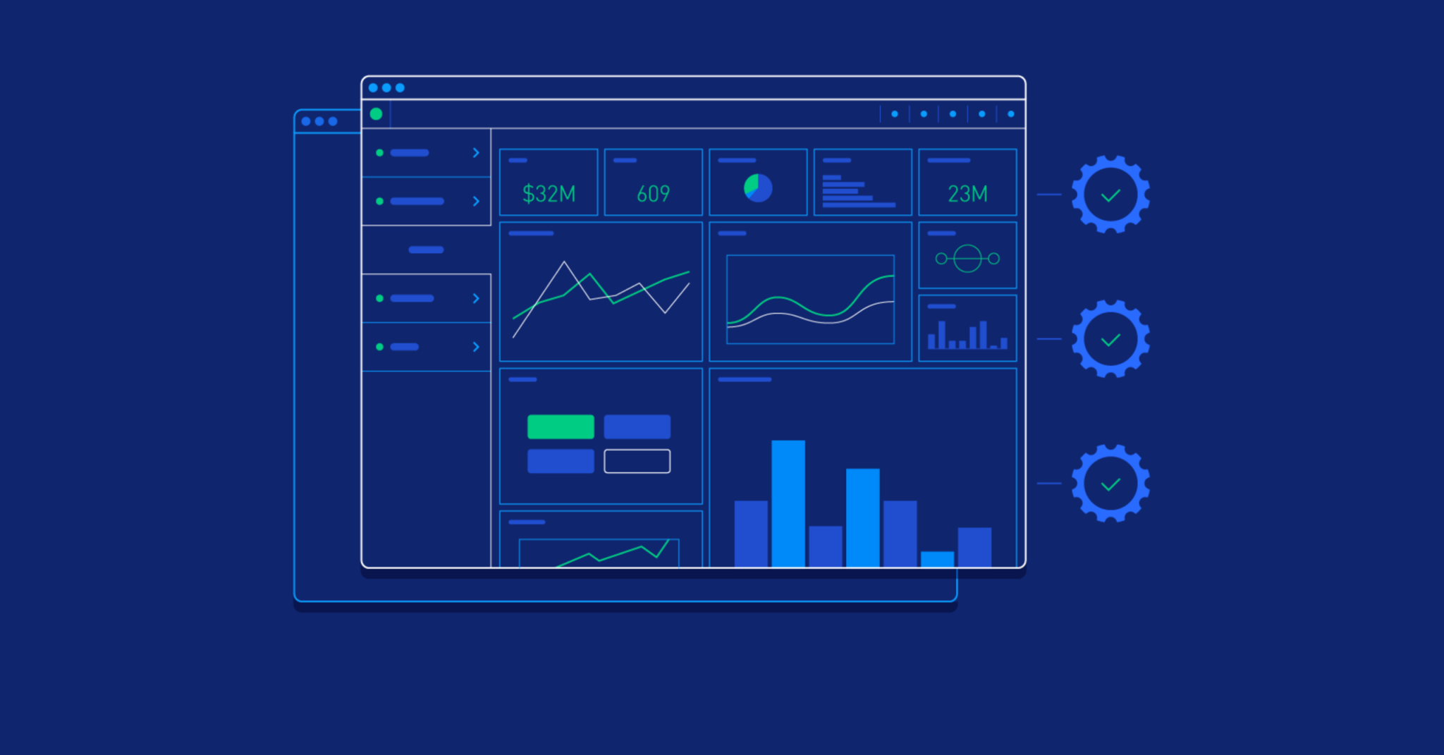
At Epicforce Tech, we have a 5-step dashboard design process that ensures we not only meet your business needs but also deliver intuitive, user-friendly dashboards that provide real-time metrics for strategic decision-making. In this blog, we’ll explain our dashboard design process, from initial wireframes to the final live dashboard.
Step 1: Understanding Business Needs and Defining KPIs
The Importance of Defining KPIs
The foundation of any successful dashboard is understanding the specific goals of your business. What do you need to measure? What data is most valuable to your team? Before we begin designing, we work closely with key stakeholders to define the Key Performance Indicators (KPIs) that will drive your business forward.
We at Epicforce Tech believe that well-defined KPIs should align with your business goals, whether it’s improving sales performance, tracking inventory levels, or monitoring customer satisfaction.
Key Questions:
- What specific business processes does the dashboard need to track?
- Which metrics are most crucial for your team to focus on?
- How will success be measured using these KPIs?
By defining these KPIs early in the process, we ensure that the dashboard remains relevant, actionable, and aligned with business objectives.
Step 2: Creating the Dashboard Wireframe
The Role of Wireframes in Dashboard Design
A wireframe serves as a blueprint for the dashboard’s layout. It’s essential to get this step right to ensure the dashboard’s usability and effectiveness. At Epicforce Tech, our team designs wireframes that reflect both the business objectives and the user experience needs.
Key Components of a Dashboard Wireframe:
- Data display areas: Where will the key metrics and KPIs be shown?
- Chart placement: How will the visualizations be arranged for clarity and impact?
- Navigation flow: How will users move through the data or access detailed reports?
Benefit: By focusing on usability and clear visual hierarchy in the wireframe, we ensure that the dashboard is both functional and easy to use.
Step 3: Integrating Real-Time Data
Data Integration: The Backbone of Effective Dashboards
Once the wireframe is in place, the next step is integrating data. Epicforce Tech ensures that your dashboard is fed with real-time data from relevant sources. Whether it’s pulling data from Epicor® ERP systems, CRM, or other enterprise systems, we make sure your dashboard displays live data that is accurate and up-to-date.
Key Data Sources:
- Sales data: Integration with CRM and sales tools.
- Inventory data: Synchronization with ERP systems.
- Customer feedback: Pulling data from customer service platforms or surveys.
By integrating live data, we ensure that the dashboard provides real-time insights that allow businesses to take quick, informed actions.
Step 4: Data Visualization for Clarity and Impact
Choosing the Right Data Visualizations
The way data is presented on a dashboard is as important as the data itself. At Epicforce Tech, we prioritize data visualization best practices to ensure the dashboard is easy to understand and makes a clear impact. Whether it’s through charts, graphs, or heatmaps, we use the most effective visual tools for each type of data.
Popular Data Visualization Techniques:
- Bar and line charts: For displaying trends over time.
- Pie charts: For illustrating proportions and percentages.
- Heatmaps: For highlighting areas of high and low activity.
The goal is to ensure that the data visualization is intuitive and highlights the most important insights at a glance.
Step 5: Testing, Refining, and Deployment
Testing the Dashboard: Ensuring It Meets Expectations
Before final deployment, it’s critical to test the dashboard with real users. Epicforce Tech conducts thorough user acceptance testing (UAT) to ensure that everything functions smoothly. We gather feedback from stakeholders and make any necessary adjustments.
Refining the Dashboard:
- Usability testing: Ensuring that the dashboard is easy to navigate.
- Performance testing: Checking for speed and responsiveness.
- Accuracy testing: Verifying that the data displayed is accurate and up-to-date.
Once we refine the dashboard, we deploy it and provide ongoing training and support to ensure smooth user adoption.
Conclusion: Empowering Businesses with Actionable Insights
At Epicforce Tech, our 5-step dashboard design process ensures that every dashboard we create delivers real, actionable insights that align with your business goals. From understanding your business needs and defining KPIs to integrating real-time data and deploying intuitive designs, we provide dashboards that help businesses make smarter decisions and improve operational efficiency.
By following this structured process, we ensure that the Epicor® dashboards we build are not just visually appealing but also strategically effective, empowering teams with the data they need to drive performance.
Are you ready to transform your Epicor® dashboards into powerful business tools? Epicforce Tech can help.
Read More:
How Our Consultants Build Sales Dashboards That Actually Drive Revenue Conversations
How Epicforce Tech Integrates External Data Sources Into Epicor Dashboards
Epicforce Tech’s Step-by-Step Approach to Unlocking the Full Potential of Epicor Dashboards
Top 10 Epicor Dashboard Widgets to Improve Decision-Making
Enhancing Business Insights with Epicor Dashboards